RV Solar Connections
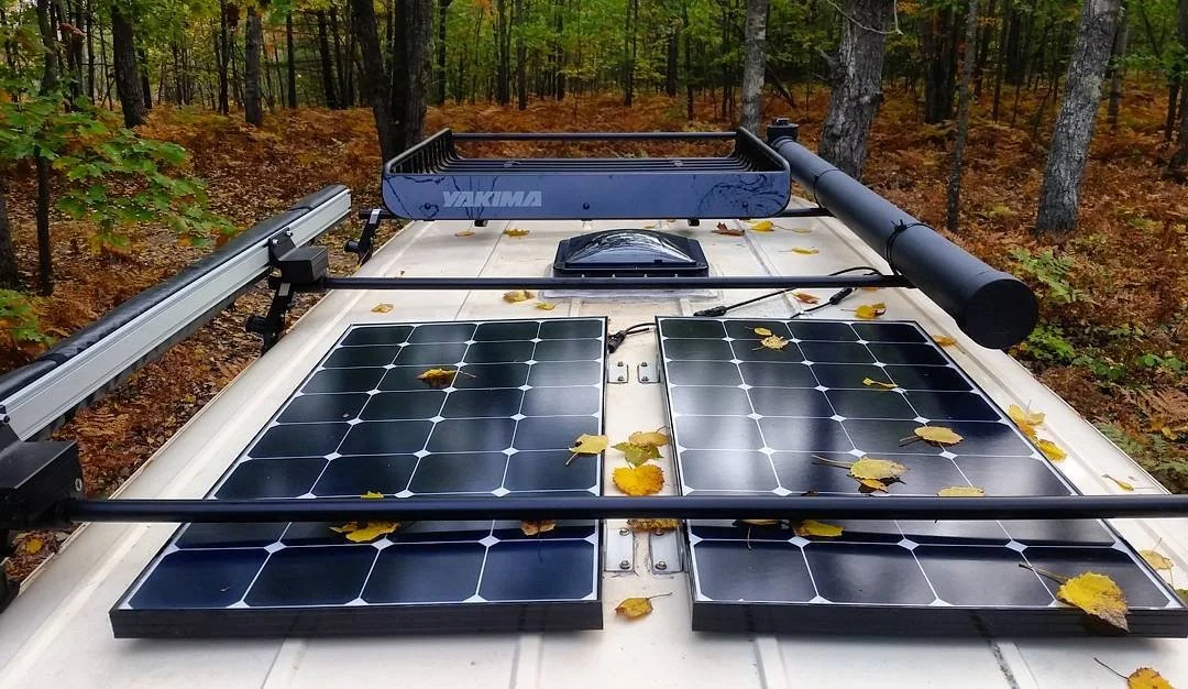
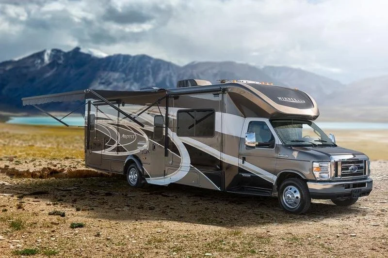
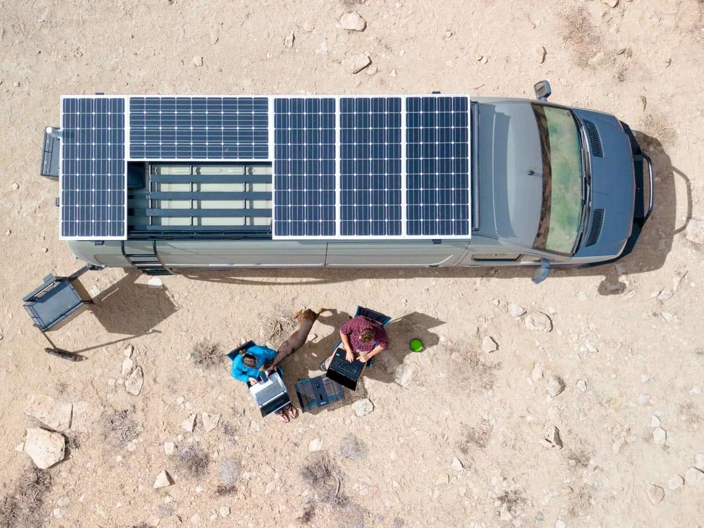
RV Solar Connections (RVSC) provides off-grid energy solutions for the mobile market, including RVs, campervans, travel trailers and more.
RV Solar Website Revamp Project Background
RV Solar Connections (RVSC) is an off-grid market that sells solar systems to the mobile home market which includes RV’s, camper vans, travel trailers, tiny homes, etc. They specialize in consultation, design, and installation services of converters, chargers, and solar panels to help customers be able to stay off-grid and not have to rely on traditional RV parks and hookups.
RV Solar Connections is run solely by our client, who recently launched an online e-commerce store where DIYers can purchase items directly from their website.
Project Goals
Focus on clients’ most urgent needs to help address and fix issues on their current website, increasing conversion rates among users with prior/existing knowledge of their buying needs.
Build framework to help streamline sales process so the client could spend more time with users that don’t have any knowledge on how to begin an off-grid project.
Roles & Team
The team for this project consisted of myself and 3 other UI/UX designers. We all participated in completing general market research and the heuristic analysis, then split up ownership of the remaining deliverables. I assisted in creating the heuristic analysis layout and red routes.
Result
The team followed a Design Sprint process to ensure deliverables were created within our given timeframe of 4 weeks.
Researched and addressed client’s critical questions to create promised deliverables:
1) Heuristic Analysis of Competitors
2) Persona Development
3) User Journeys
4) Red Routes
5) Wireframes
The Problem
The business aims to increase sales/conversions on their e-commerce site for customers who already understand their power needs. The goal is to increase streamlined sales and spend less time on consultations.
The Solution
After consulting and discussing the identified “Problem” with Caza on our initial kickoff call, the group decided that the most important issue to spend our time on was to focus only on the users who already know what they want and have some knowledge of their solar needs.
Although Caza understands that this group only accounts for around 20% of his user base, he also sees the opportunities for streamlined sales with the users that require the least amount of his time consulting and educating. Once he can get the website developed for these target users, he can focus other time for the approx 80% of users that don’t have any solar power knowledge, and will need a lot of 1:1 time with Caza.
As a team, we decided that the solution would be to do secondary research into the RV and solar industry, and then use that information to build out a wireframe.
Due to our time constraint of our IDP timeline, we were only able to produce 4 weeks worth of work. With that being said, we made great use of our time like so:
Week 1: Heuristic Analysis of Competitors
Week 2: Persona Development
Week 3: User Journey + Red Routes
Week 4: Low Fidelity Wireframes

Team meeting going over User Flows

Final team meeting going over wireframes
The Research Process
In order to understand the issues we aimed to address, we set out to better understand what competitors were doing. This was accomplished through a heuristic analysis done on six competitor’s sites as well as the current RVSC website. We followed up with a thorough analysis of both the client’s and competitor sites in order to measure how easy it was for users with some knowledge of solar energy to search and purchase products from the competitor sites.
Heuristic Analysis
Due to the client’s wishes, we will be keeping the identify of these competitors anonymous for this report. We conducted the analysis by evaluating the sites using the following three Nielsen Norman’s usability heuristics:
Match Between System & The Real World
Recognition Rather Than Recall
Help & Documentation
We decided that these three heuristics were the most important in aiding users to achieve the goal of navigating through a website and completing a purchase as these heuristics are vital in creating a clear path to purchasing. The images below are some examples of each heuristic we analyzed from the different sites.
To access the full heuristic analysis report, click on the button below.
Heuristic Analysis Takeaways
Based on our findings, we came away with a handful of action items that we thought would be important to incorporate into our upcoming designs:
Present users with pre-made solar kits as a purchase option.
Add a more extensive nav menu to the site.
Provide definitions to users that explain internal jargon.
Build an FAQ page for questions that users might need answered in order to complete their purchase.
Personas
Since our research problem only focused on those who already understand their power needs, we created two personas using the findings from the secondary research we conducted on the industry market and user groups.
These two personas helped the group relate to an actual user’s needs, wants, and thought processes, and would be at the forefront of our design decisions moving forward.
Persona 1: Tyler (Digital Nomad)
Persona 2: Joe (Weekend Warrior)
User Journeys
Using the personas we developed, we moved onto the crucial step of creating user journeys. A user journey shows the path a user takes in order to complete their goal of purchasing products when visiting the RVSC online store.
Each user journey consists of four stages: explore, compare, consider, and purchase. The stages highlighted in green show where the user is currently having an easy time navigating while the items in red show current pain points. These are places where the journey could be improved to make the user more self-sufficient.
Red Routes
We used the data and insights from the two user journeys to create red routes, which helped us and our client visualize the exact decisions both personas would be making as they navigated the site. The red routes for each user represent their most critical path, which in this scenario, is the path to purchase.
Tyler comes with prior knowledge of his needs, and has done some research off of the site. He uses the search function on the RVSC website to type in exactly what he needs. Joe, on the other hand, is less familiar with the topic and looks to do some more research and comparison prior to purchasing. He navigated the site by filtering his search, and visited a page with FAQ and additional resources to learn more before he makes a decision.
The Design Process
Once our users’ wants, needs, and expectations were identified, we moved on to the design phase. During this step, our team worked on the creation of our wireframes, using the information we’ve gathered up until now.
Wireframes
During the fourth and final week of our project, we used all of our findings to create a tangible recommendation to our client in the form of wireframes. These low-fidelity screens visually portrayed the key changes we recommended our client to use for their future revamp of the website, based on our research and understanding of target users.
Homepage & Menu Updates
Menu Changes
Add drop down category links under “Shop” to provide users a quicker way to orient themselves and
start shopping.Remove the “Home” button as it is redundant, since users can navigate to the homepage by clicking the RVSC logo, and removing it will free up real estate for more important items.
Nest “Contact us” under “About us” to free up space, and also encourage users to begin their shopping experience before immediately reaching out to the client for advice.
Add a link to Resources, a new page we recommended our client add, which will include FAQ and tutorials.
Homepage Changes:
Update the main CTA on the Hero image to say "Shop by vehicle type" in order to direct users down a search funnel, which they can use to find products that best suit their needs. As it stands currently, the "Get Started" link leads to a contact form.
Swap out the CTAs on the two info blocks below the Hero image to better advertise Resources and Kits. This will encourage users like Joe, who understand their buying needs but still have some gaps in knowledge, to complete their purchasing journey on their own.
Page Additions
We created an additional page for users to choose the vehicle type they are shopping for in order to help them narrow down their search. This greatly benefits users like Joe in helping direct him in his shopping needs. The "Shop By Vehicle Type" page is where users will land after clicking the CTA prominently featured on the Hero image of the homepage.
We also created a resources page that includes a section for FAQ and tutorials. Users who are on the fence about buying a product because of outstanding questions can find answers directly on the RVSC site, and they won't abandon their web sessions.
Search Results
The key recommendation made for the search results page was the addition of filters. We included kits, vehicle type, and budget in our filter list. The current search results page does not allow the user to hone in on the items they are looking for, and both Tyler and Joe could make use of a filter feature. Joe might decide he wants to only look for kits, as opposed to individual products, while Tyler might be looking for a particular product, but on a budget.
Product Page
The current product page is organized in a way that some users might find confusing. There is a lot of white space, and users need to scroll down to find pertinent product information.
We recommended that the client rearrange the product image and its thumbnails to make the page more visually appealing by removing the excess white space. Moreover, we recommended adding a comparison feature so users can easily understand the difference between the products they're viewing. Providing users easy access to direct comparisons will give them confidence; they know that what they are buying is the best option for their needs. Ultimately, buyer confidence should increase conversion rates.
Conclusion
In the future, RVSC plans to work with other designers to continue growing their business. Our timeline did not allow for user testing which will be crucial for understanding whether our proposed changes will amount to increased conversions. During our final meeting, we provided the client with a recap of our process as well as recommended next steps, shown in the diagram (next slide). The items marked with an "X" are deliverables we completed, while the bullet points represent future recommendations.
Collaboration amongst our team members was paramount to the success of this project. Each designer's unique perspectives and work helped in delivering the best end result for the client. When implemented, we believe our recommendations will allow users who understand their buying needs to more seamlessly navigate through the RVSC site to find, and then purchase, the items they need.


