FitBlast
FitBlast is a mobile fitness application that encourages users to better their lives through fitness and healthy habits by combining fun workouts and social tools. Our mission is to to help users train and reaching their goals—with GPS tracking, guided running workouts, custom workout plans, and friendly motivation from friends and other users—while still having fun along the way
My Role: UI/UX Designer and Researcher
The Problem
Staying fit and working out can often feel like a drag, especially when there’s little to no motivation to do so or when no one can be present to hold you accountable. There is currently no workout mobile app on the market that allows friends and family members in a group to directly message and help motivate and push one another.
The Solution
Our solution was to create new features within the app to help promote ongoing engagement and prevent users from dropping off of the app. Features such as integrated messaging would create sustained engagement and repeat usage while helping users maintain accountability when trying to hit fitness and health goals.
We also believe that by gamifying certain types of workouts, users will be more willing to participate in challenges with friends and peers due to the fun and competitive nature of such games.
Project Background
In a day and age where the lack of time makes it hard for people to find time to do things they want, FitBlast strives to make it easy for fitness to be easily integrated into everyday life. We provide users with a friendly and easy-to-use app to find workouts suited for everyone- workouts designed for solo use or for groups of peers!
Research Process
The first step in my process in addressing the problem was to conduct research of recent trends of the fitness industry. It’s no secret that the pandemic has changed the world forever, and fitness was no stranger to this massive change.
Self-efficacy, innovative propensity, outcome expectations, and engagement were key variables affecting the intention of users to continue using fitness apps. With this information, I developed a list of research questions.
Research Questions:
What motivates users to want to be healthy and fit?
What are some fears that deter users from wanting to start a healthy lifestyle?
In what ways do fitness-interested people keep track of their goals?
What do fitness app users like or dislike about the apps they use?
Secondary Research
Being someone who has always held fitness as an important means to leading a healthy life, I took a dive into the data and research of the changing climate of the fitness world. Some astonishing statistics I found included:
As of 2020, the global fitness app market size is valued at $4.4 billion, and is expected to expand at a compound annual growth rate of 21.6% from 2021 to 2028
As of Sep 2020, global downloads of fitness and health apps have increased by 46%
During the COVID lockdown, 74% of Americans used at least one fitness app, and 60% planned to cancel their gym memberships
Based off these 3 categories (exercise & weight loss, diet & nutrition, and activity tracking), here is the growth of the US fitness app market size from 2016 to 2028 in USD million
Competitive Analysis
To address how FitBlast could stand out from other competitors on the fitness app market, I studied the apps of several industry leaders by immersing myself as a first time user on their platforms. There were tons of things I liked about each app, and some features I wish was improved upon. By doing research as a user, I hoped to avoid some imperfections of each app while also emulating their most effective features to create a seamless user experience. The four apps I focused on for competitive research were Classpass, Shred, Nike Run Club, and Map My Run.
One of the things I realized when researching these top industry apps was that none of them had messaging functions, so I referred to Facebook Messenger and Apple’s Messenger for chat feature research.
Click on the button below to access the full expansive set of research notes (both secondary and competitive).
Affinity Mapping
I organized the notes I took while performing secondary and competitive research and created sticky notes of important points that were jotted down. Using those notes, an affinity map was born- where bundles of similar details and facts were grouped together. This helped me to organize and build out areas of focus with clarity.
Empathy Mapping & Personas
I built an affinity map based off of what/how the user says, thinks, does, and feels to help me build personas that best represented the users I wanted to represent. This was extremely helpful for me to view both needs and obstacles from several different lenses and scopes.
I ultimately created 2 personas with what I mapped out, and made sure they represented users from different lifestyles. The traits, needs, and desires of these two opposite personas helped sculpt what to include in the MVP (Minimum Viable Product).
Meet Franklin and Amanda!
User Stories & MVP
The personas and empathy maps helped me build my user stories (click the underlined link to access). They are written in first-person point-of-view to detail all of the different paths that one might take on the app.
To best design an impactful product, the most important focuses from the user stories were used to create a MVP by focusing on details to make FitBlast inclusive of what users want. They were designed with the intention of making them functional, reliable, usable, and empathic in design.
Feature 1: I want to be able to share workouts with friends so they could join me in the same workouts to keep it fun (Direct messaging)
Feature 2: I want to be able to share my workouts online because words of affirmation help push me (Social feed and features)
Feature 3: As a user, I want to be able to chat with a group of friends because we all want to be involved with each other’s fitness journeys (Share results in group chats)
Red Routes
From the MVP, I created 3 main red routes of critical paths that users would take while using FitBlast:
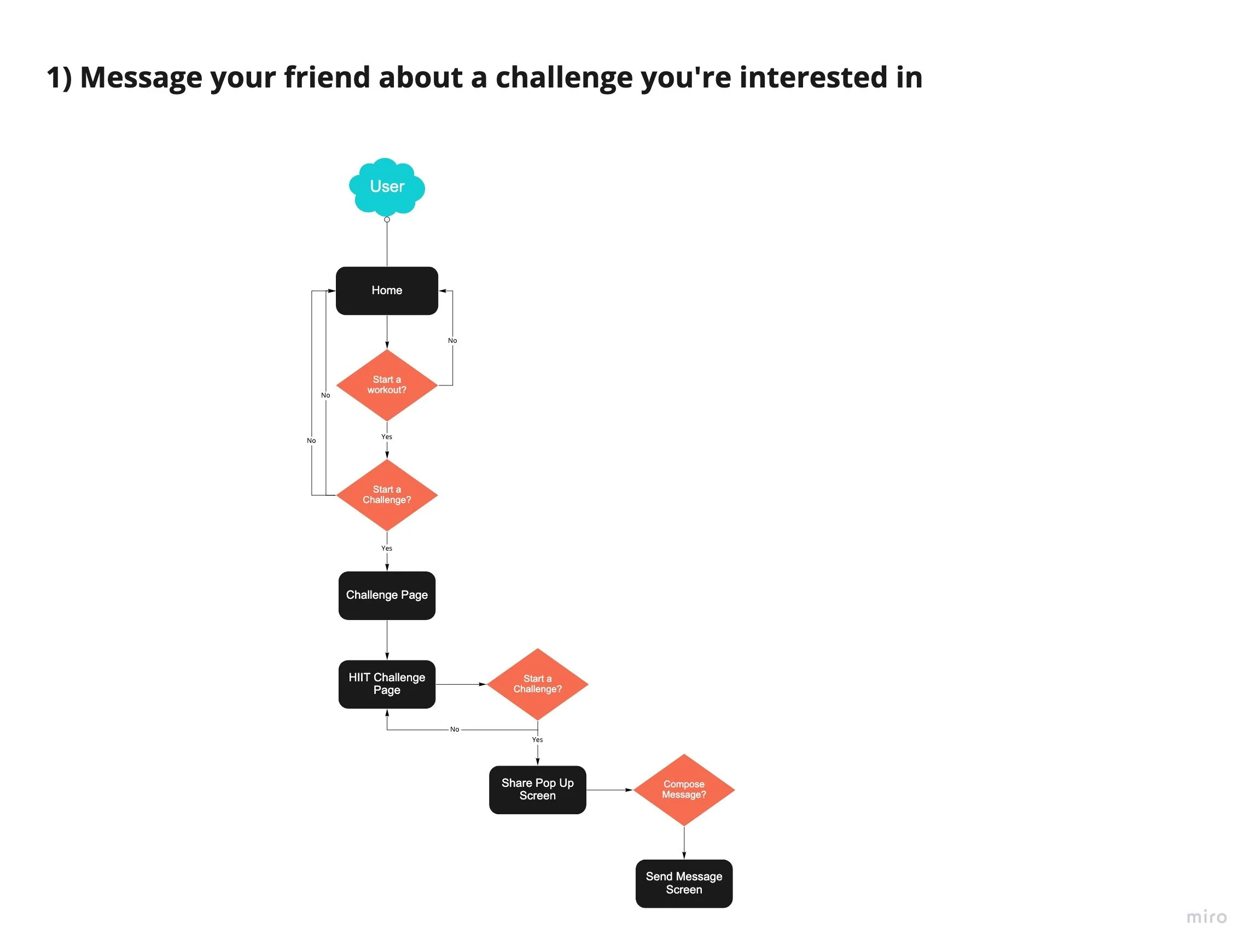
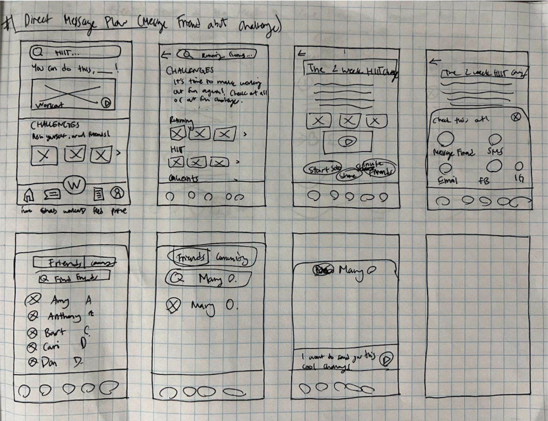
Red Route 1: Direct message flow (message a friend about a challenge)
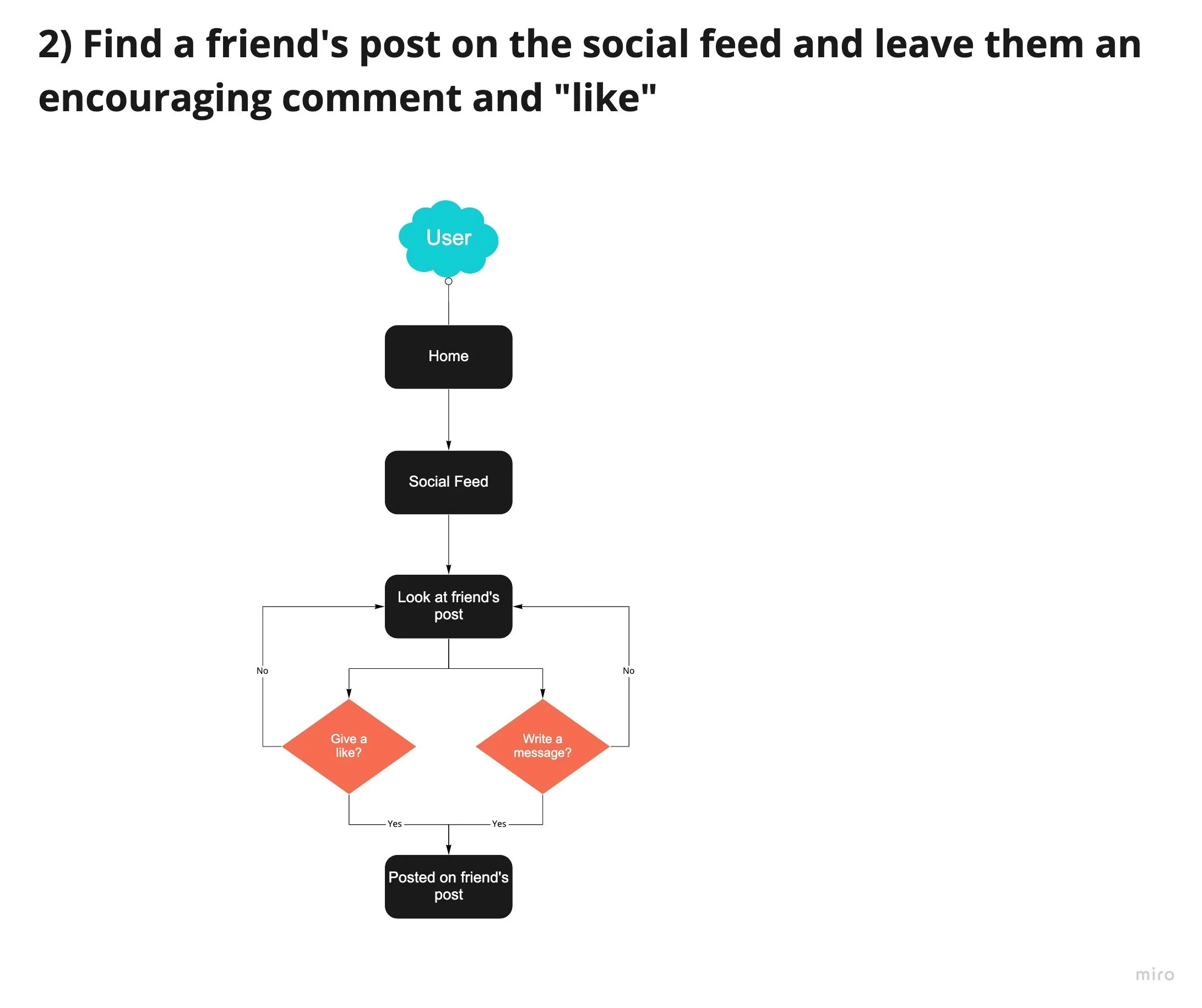
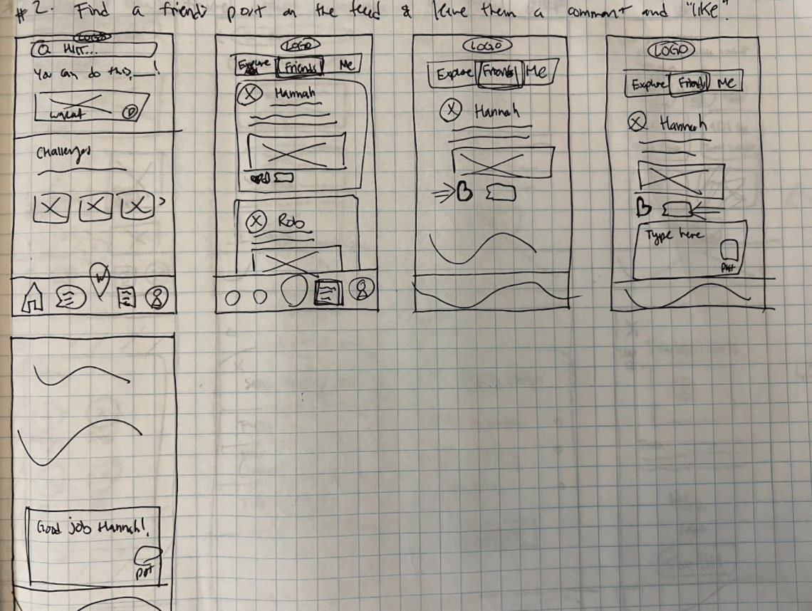
Red Route 2: Social feed flow (leave a comment and like on a friend’s post)
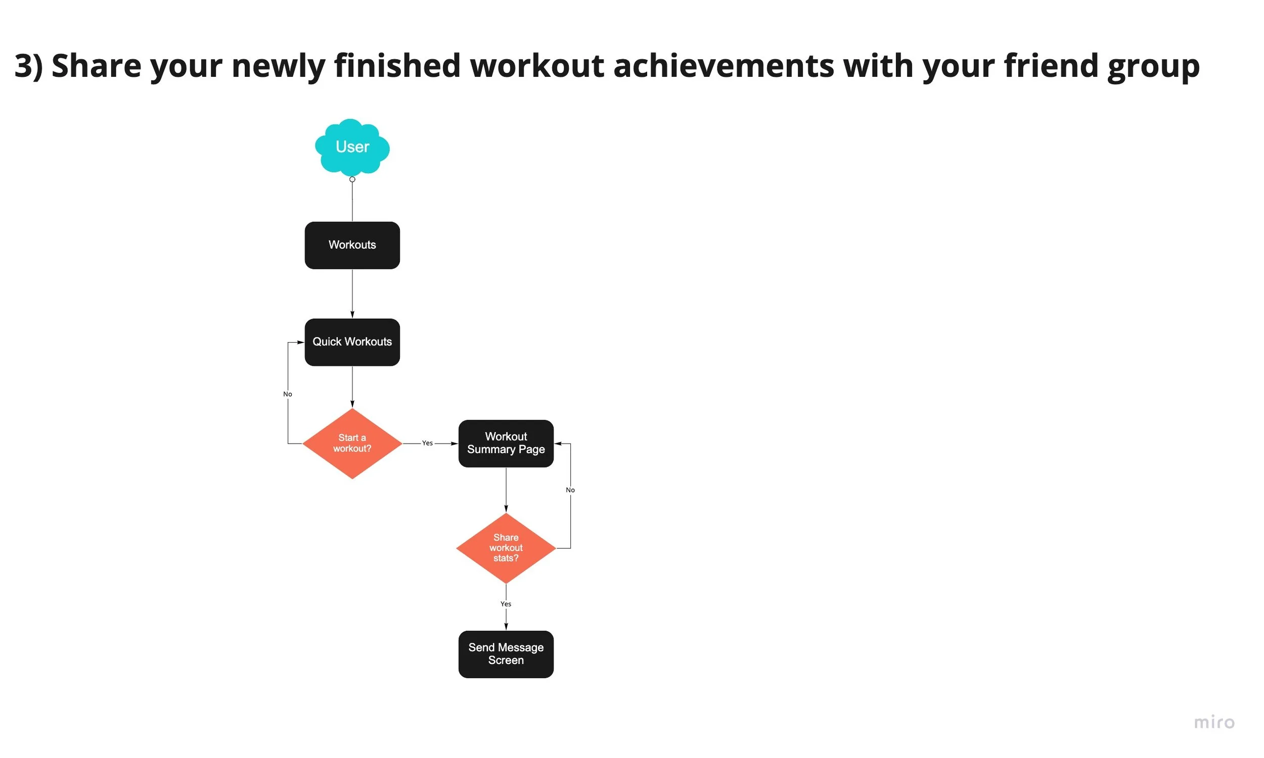
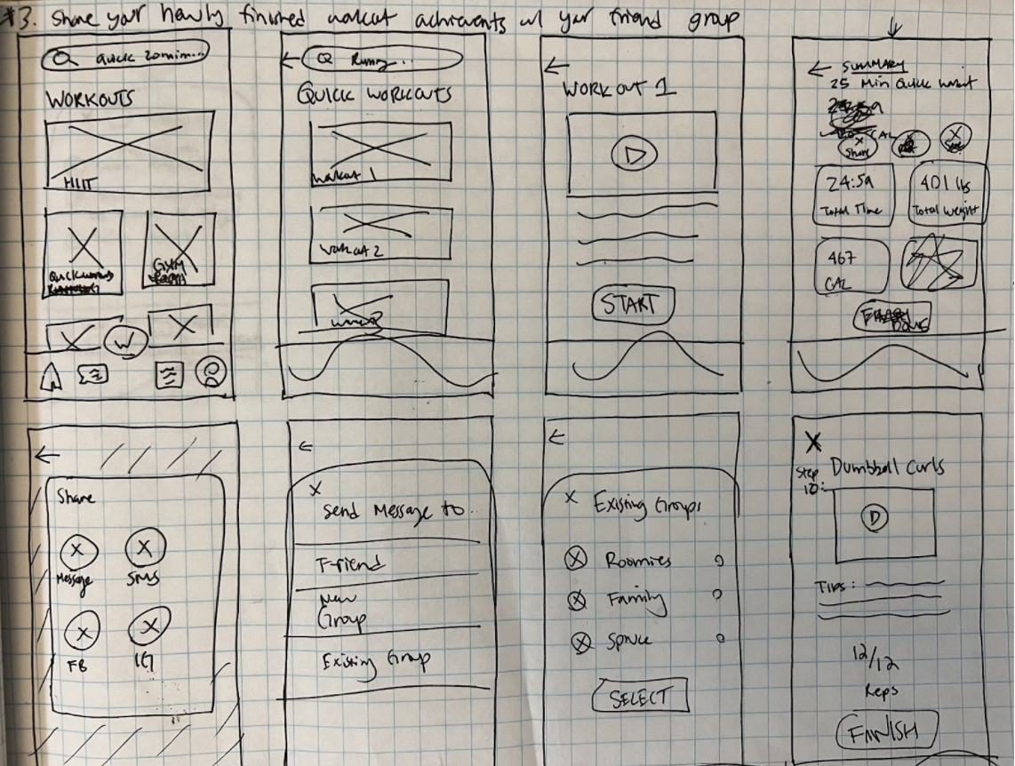
Red Route 3: Group chat flow (share workout stats with a group of friends)
Sketches
The first version of the app came to life in the form of doodles and sketches, which initially included only the most minimalistic features that my 3 red routes focused on.
Home Screen
Home page utilized photos and videos for friendly welcome and high energy boost.
Red Route 1: Direct message flow (message a friend about a challenge)
On the workout landing page, a CTA was highlighted to be able to show users they can share workouts with others to try and get friends to join workouts they’re interested in.
Getting friends to do workouts together promotes the social and encouragement aspect of “team sports”.
An activity sheet for sending messages popped up, where users then could select from friends or group chats they’d like to share the workout with.
Red Route 2: Social feed flow (leave a comment and like on a friend’s post)
Users could see what their peers were doing, what workouts they’ve completed, and can share their own feats with others (social encouragement).
Social actions are available for users to use, such as likes (heart) and comments, to help users push each other to improve and give “kudos” for their accomplishments.
Red Route 3: Group chat flow (share workout stats with a group of friends)
The ability to share accomplishments with others is a way to promote positive collaboration with peers.
The loud CTA makes it easy to share workout results with friends and groups of friend.
Working out with friends is proven to help users stay motivated.
Wireframes
The paper sketches were then turned into low-fidelity wireframes, which were created on Sketch. I was able to bring messy drawings and thoughts to life, which made it a lot easier to visualize what the early stages of FitBlast could look like. Admittedly, my sketches are barely legible (especially to someon who isn’t myself), so creating low fidelity versions helped out a lot.
Usability Testing
To test the functionality of the low-fidelity wireframes, I conducted guerilla usability tests with 4 users with a list of questions and tasks. Two tests were done via Zoom through inVision and two test were done in person.
I encouraged the users to think out loud and to make sure they felt comfortable knowing that there were no wrong answers, and that my sole purpose was to get as much honest information from them to help build the best possible version of the app that I could. With all of the users, whether online or in-person, I was able to observe all movements, such as cursor movement, eye movement, and body language. Any hesitation, pause, and wrong clicks were enough for me to take note that whatever was being tested wasn’t as intuitive as I hoped, and that those functions had to be corrected.
Some main points of feedback that helped me iterate the wireframes included:
The search bar at the top of the home page was confusing; made it seem more important than it was.
Naming conventions needed to be more clear (ex: invite friends vs. share, or “challenges”).
Can’t tell which CTA was the primary one (they all looked equally important).
Requires more instructions with each section for clarity.
Redundant items such as copy link made it confusing for users to know exactly what to do.
Chat setup took too many steps and is not intuitive.
Style Guide
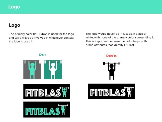
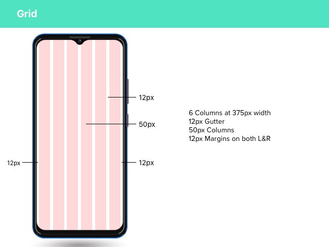
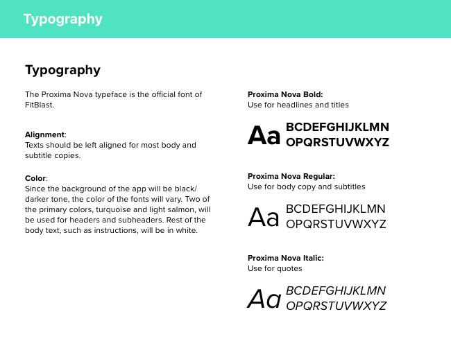
I created a mood board to visually lay out the vibe and look I wanted to see from a high-energy workout app. From there, a style guide for several features was created to keep me consistent when designing screens.

Design Process
In establishing a brand platform for FitBlast, it was important to determine the mood and vibe that the brand would give off in order to get users excited to willingly adopt a new workout app into their lives.
I dove back into my secondary research and feedback from usability tests to set the tone. To prevent declining user engagement, the tone and attitude of FitBlast had to give off high-energy to garner excitement and continuous curiosity. Every page, from the homepage to the workout screens, would look lively and appealing.
High Fidelity Wireframes
After going through iterations of the sketches and low-fidelity wireframes, high-fidelity mockup screens were then created.
Color Accessibility
To ensure accessibility, I performed a color accessibility test on Contrast Grid to see that the colors would all pass WCAG 2.0 and WCAG 2.1 standards for however the texts, buttons, and icons were presented.
I would consider this step to be one of the most important aspects of iteration. There were several screens that ended up needing fixes, which were then made in my next round of iterations. Here’s one example:
The red used for the notes under “Your Current Challenges” was used to show that the user doesn’t currently have any challenges they’re participating in (if they were, images like the ones below would show up in lieu of the red text).
The red used here, #F23737, was too dark and ultimately did not pass the accessibility test.
This led me to not only alter the error red color to #F09393, but to bold it as well.
User Testing & Iteration
I used Sketch for all aspects (wireframing, low fidelity, high fidelity screens) of the design process. To test prototyping with users, I used InVision. Due to the nature of the ongoing pandemic, I was able to only run 2 tests in person, but conducted the other 2 via Zoom. All users were encouraged to speak and think out loud while testing the prototype as they completed the three red routes.
After fixing the design flaws after the second round of usability tests, I started to hear confirmation from users of the improvement.
“Love the dark and bright contrast for the app”
“The messaging system is very easy to use and find”
“This summary page has all of the details I’d want to know after a workout”
“I like how you can see what other people on the app are doing at a glance”
What I Found
Strengths
Users appreciated clear images & videos that showed exactly what users would be doing during the workout.
Good details were included to satisfy what a workout app user would like to see in the results (total time, muscles it works, equipment needed).
Direct messaging flows are simple and effective, and get where you need to go quickly.
Dark background with bright colors looked lively and brought energy.
Clear CTA buttons made it easy to decide for users to find the next actions.
Opportunities
Naming conventions are important; words that sounded too close to another meaning often confused users.
Page hierarchy is key- order of offerings listed determine how important an user viewed the section.
Padding and spacing are important and must be consistent throughout the app.
Don’t overcomplicate actions or add too many offerings- users like simple & easily understandable actions.
Accessibility issues are noticeable to the naked eye- not only for people with eyesight disabilities.
Prototype
Click on the button below to access the prototype on another page, or play with it down below!
What I Learned
FitBlast was a passion project for me, as athletics and fitness is a huge part of my personal life. I’ll admit, it was quite tough to make design decisions based off of what I thought I liked in a fitness app, versus what everyone else looked for, especially those coming from different backgrounds.
Through the whole process of researching, planning, designing, and iterating, I grew to learn that not only should any apps be simple to learn and use, but it must be built for every type of user. In this instance, all types of individuals who want to incorporate fitness into their lives have to be considered (age, fitness level, interests, etc). When it comes to a fitness app, people don’t want overcomplicated lingo, words, and designs- they just want a well-functioning app that provides them all types of workouts that are enjoyable and accessible. This proved to be true when several users were confused by my naming conventions for tools, such as sending messages to groups vs. friends.
To promote repeat usage and to avoid user drop-off, FitBlast was made to be a social fitness app, where talking to other peers, whether it be direct messaging or interacting on social feeds, was highly promoted. Gamifying workouts also became a strategy to promote a fun and interactive type of workout, where it promoted inviting others to join you in a “challenge” to raise competitiveness and engagement.
FitBlast has the right gears and design tools to help users easily learn how to use the application by being highly intuitive and straightforward. The app has the perfect balance of everything a user would want when using a fitness app: fun, social tools, and most importantly- workouts that fit every type of athlete out there! The perfect mix of all will drive users to use FitBlast regularly when they want to improve their fitness lifestyles.
