Pawtners
Pawtners is a geosocial and online networking platform geared towards helping dog owners find friends not only for their furry companions, but for themselves as well. Profiles are set up for both the dog owner and their dogs; users can find, view, and message other users through location and other detailed search functions.
My Role: UX/UI Designer, User Researcher (Research, Wireframing, Interface Design)
The Problem
With today’s trend of decreasing natural social interactions in society- whether it’s due to the pandemic or less time in the day to spend making connections in the real world- Pawtners aims to help connect adult dog owners (and their dogs) to one another in and around their communities.
The Process
User research (surveys, user interviews, affinity mapping, persona creation)
Creation of user journey and user flow
Sketches
Wireframing
Low and high fidelity wireframes
Usability tests
The Solution
I wanted to create an experience that helps disconnected, social, and adult dog owners find one another on a fun, safe, and easy-to-use mobile platform. Social apps enable like-minded users to connect with one another online based on common interests and goals, thereby helping to remove the awkwardness of approaching total strangers in person.
This also aids dog owners in finding the perfect and safest matches for their furry friends to play with, as users would be able to choose and decide what types of dogs their own would play with.
Project Background
Pawtners enables users to branch out and create new bonds for both themselves and their dogs. As we live in a digital age where humans use technology more and more, Pawtners aims to help create friendships from and within the virtual world. This brand promotes safety and trust when conducting conversations, making it exciting and fun for users when browsing to expand their social network, and finding new playmates for their furry friends at the same time!
Research Process
To better learn about my market and target audience, I scoured the internet for data to create my initial questions:
What are the benefits of dog owners socializing and connecting?
What types of things do dog owners look for in a social setting?
Who are my main target audience groups (age, gender, etc.) for these needs?
What are some reservations that people have about online/social platforms?
What do dog owners look for when finding friends for their dogs?
What I found in my secondary research, and really my “why” for this passion project, was the overall emotional and health benefits that come from being a dog owner and the overall joy of life spent with dogs. Dog owners experience higher levels of happiness, emotional support, reduced stress, and less anxiety and depression. Click below for my list of problem statements and solutions.
Secondary Research
Once I identified these problems, I scoured the internet for information relating to the benefits of being a dog owner- everything ranging from health to social perks. From a variety of reputable sources ranging from PhDs to psychology experts specializing in the mindset of dog owners, I was able to discover valuable insights. Click the button below for my full set of research notes.
Screeners Survey & User Interviews
After carefully analyzing my notes, I created a screener survey that would help me identify the best individuals to interview in order to get some personal opinions of real dog owners. The criteria for the survey included:
Age & Gender
Dog owner status (currently owns dog, previous owner, etc.)
How they conduct research about anything dog related
Time spent on phone daily
From the pool of survey applicants, I decided to pick 5 users to interview. Due to time constraints, I believed the quantity and quality of information I could gather from 5 users was exactly what I needed to get the most valuable and differenciated data out of a group of users. These 5 users ranged in both age and gender, but all had the experiences of being a dog owner at the time of the interviews. This project was conducted in May 2021, hence the need to heavily rely of the power of tools such as Skype and Zoom.
Affinity Mapping
I received plenty of useful feedback from my interviewees about their experiences as dog owners including: things they looked for in dog playmates, how they looked up dog friendly places to bring their dogs to, their thoughts about dog meet-ups, experiences with meeting strangers (both in real life and from online).
I sorted out these different insights by jotting them down on post-it notes, then grouped and named them based on their similarities. This step was crucial in helping me properly plan and organize mass amounts of random raw data for my next stages of research: personas and empathy maps.
Empathy Mapping & Personas
The information I gathered and analyzed from the affinity map helped me zero in on the type of audience and personas I wanted to create in order to represent the user base. These notes were particularly helpful for this process because I got to step into the end user’s shoes and fully understand all of their feelings, emotions, and thoughts as dog owners. There are different types of dog owners out there (myself included) and even more different types of humans.
The two personas I created helped keep me balanced between the different types of users and personalities out there and also kept my mind open as to how certain features would benefit different groups. I now introduce: Adam Rodgers and Ashley Chao. The traits, needs, and desires of these two opposite personas helped sculpt what to include in the MVP (Minimum Viable Product).
User Stories & User Flows
The personas and empathy maps guided the creation of these user stories. Written in the first person format to help put myself in various users’ shoes, they help show all of the different potential paths that one might take on the app.
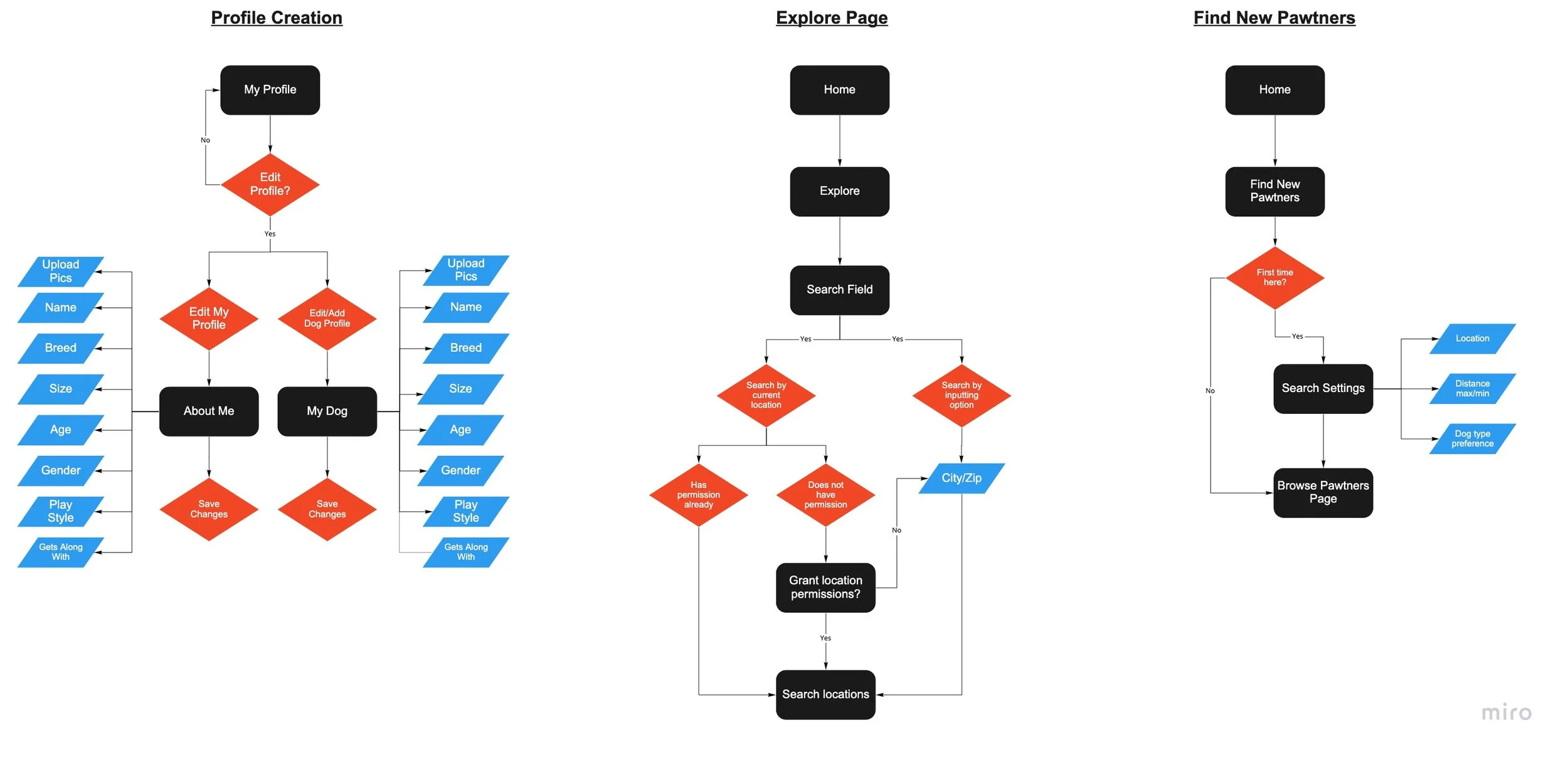
From the user stories, I was able to create user flow diagrams to show the navigation of three red routes, showing the different paths of decisions a user could take on the app.
Sketches & Wireframing
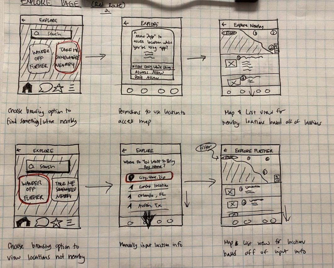
The design began to take form in a minimalistic sketch that included functions such as: searching for other user’s profiles, location finding, chat abilities, and more.
The home page showed 3 main functions: Explore, Finding New Pawtners, and the Hooman Social Corner.
A user was able to update their profile information with facts and pictures they wanted to share with others (things strangers wanted to know about one another before potentially meeting up in person).
Dogs had their own profile pages to share information deemed necessary (through research and user interviews) to know about when setting up doggy play dates (gender, age, behavior, etc.).
A location search feature was created for users to be able to view popular dog-friendly destinations around them and abroad, which included the pages that would share details and images about these locations.
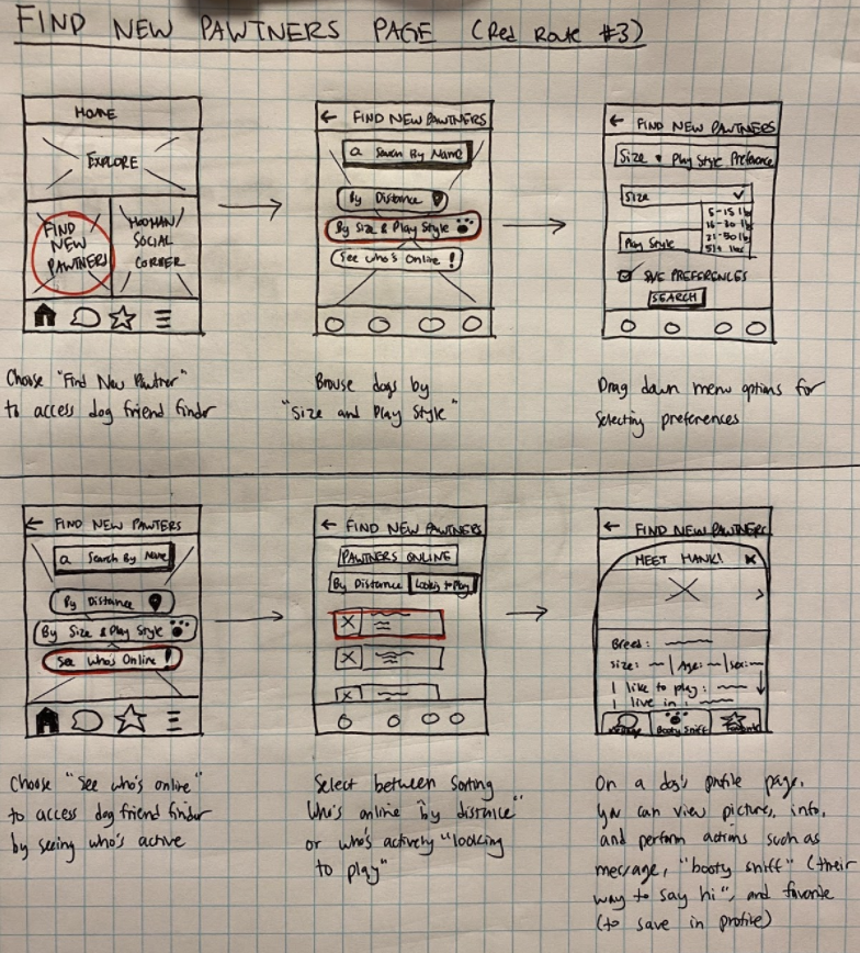
After the features were planned out, my pen hit paper and I was finally able to start sketching out preliminary drawings. This process went through quite a number of iterations before I finally decided on which sketches to work off of. Each page was made up of the screens it would take to deliver the red routes planned from our user stories.

Wireframes
The previous sketches were then turned into low-fidelity wireframes created on Sketch. This process brought the initial messy drawings to life and made it clearer to visualize what the app could actually look like.
Design Process
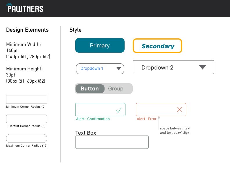
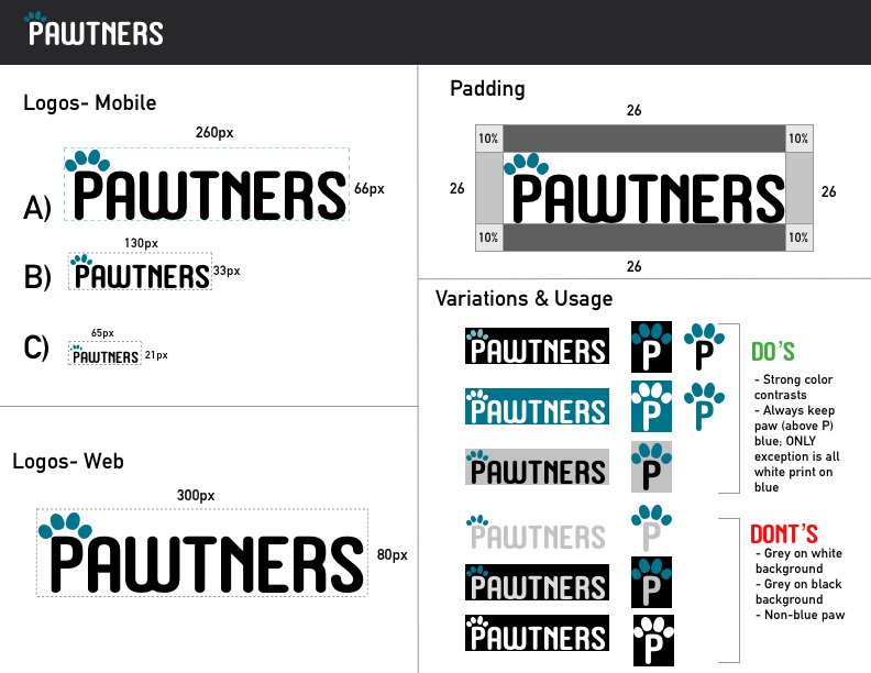
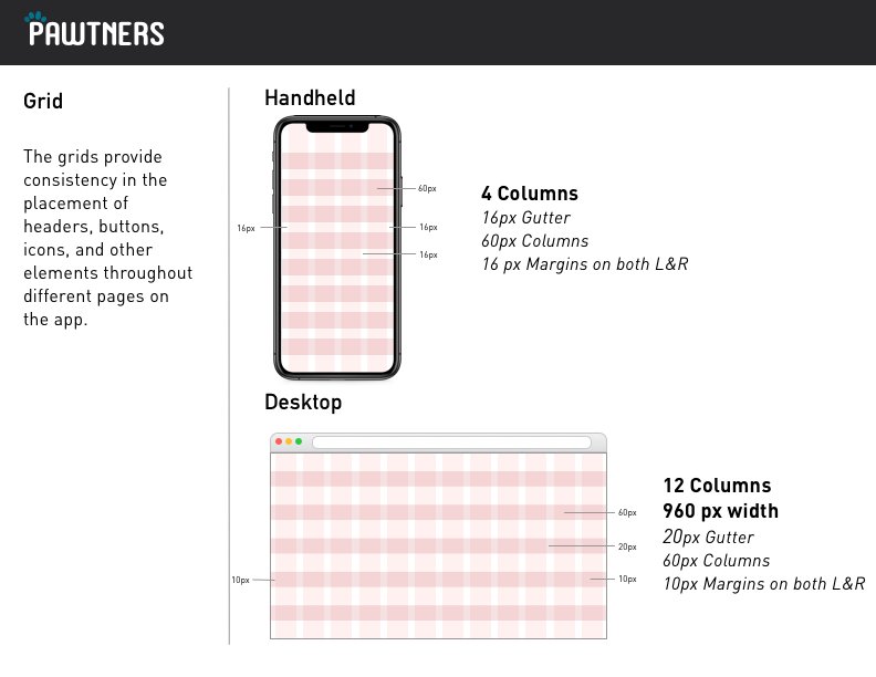
It was finally time for deciding how Pawtners would present itself visually. Using all of the work done through the discovery phases of the project, I was able to create a mood board and a style guide to refer to when designing the rest of the app.
Style Guide
A style guide allowed me to stay consistent when designing my screens. It included: design elements, grid, imagery, logos, color, and font.
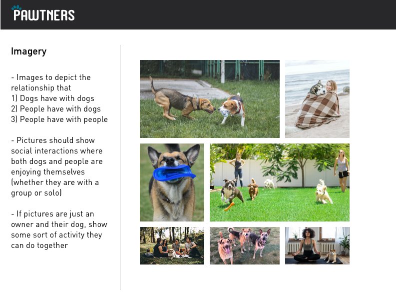
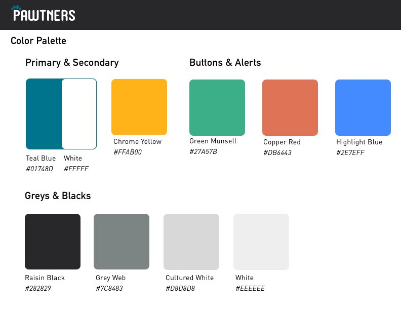
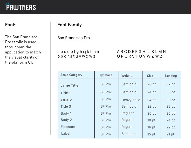
High Fidelity Wireframes
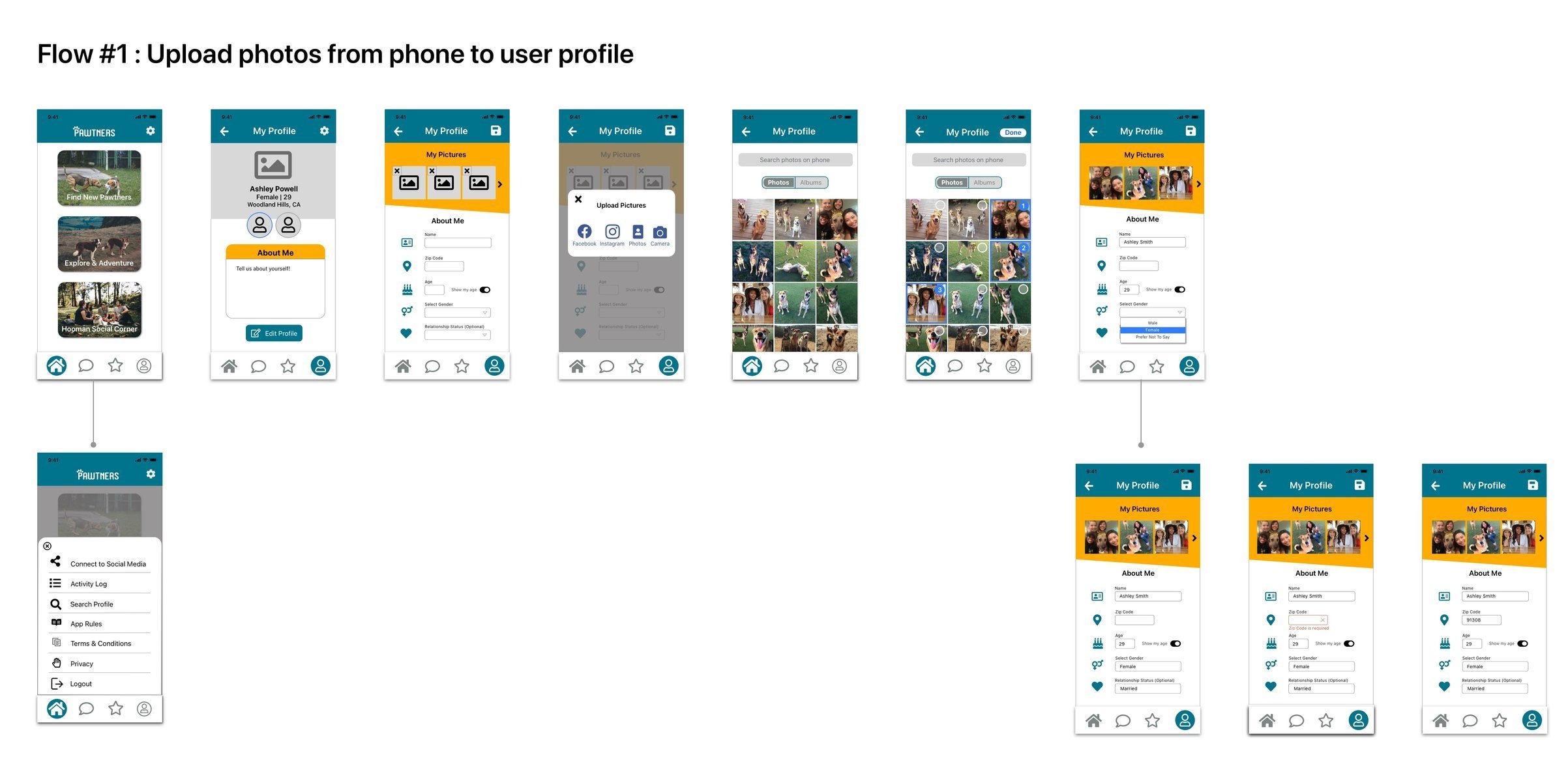
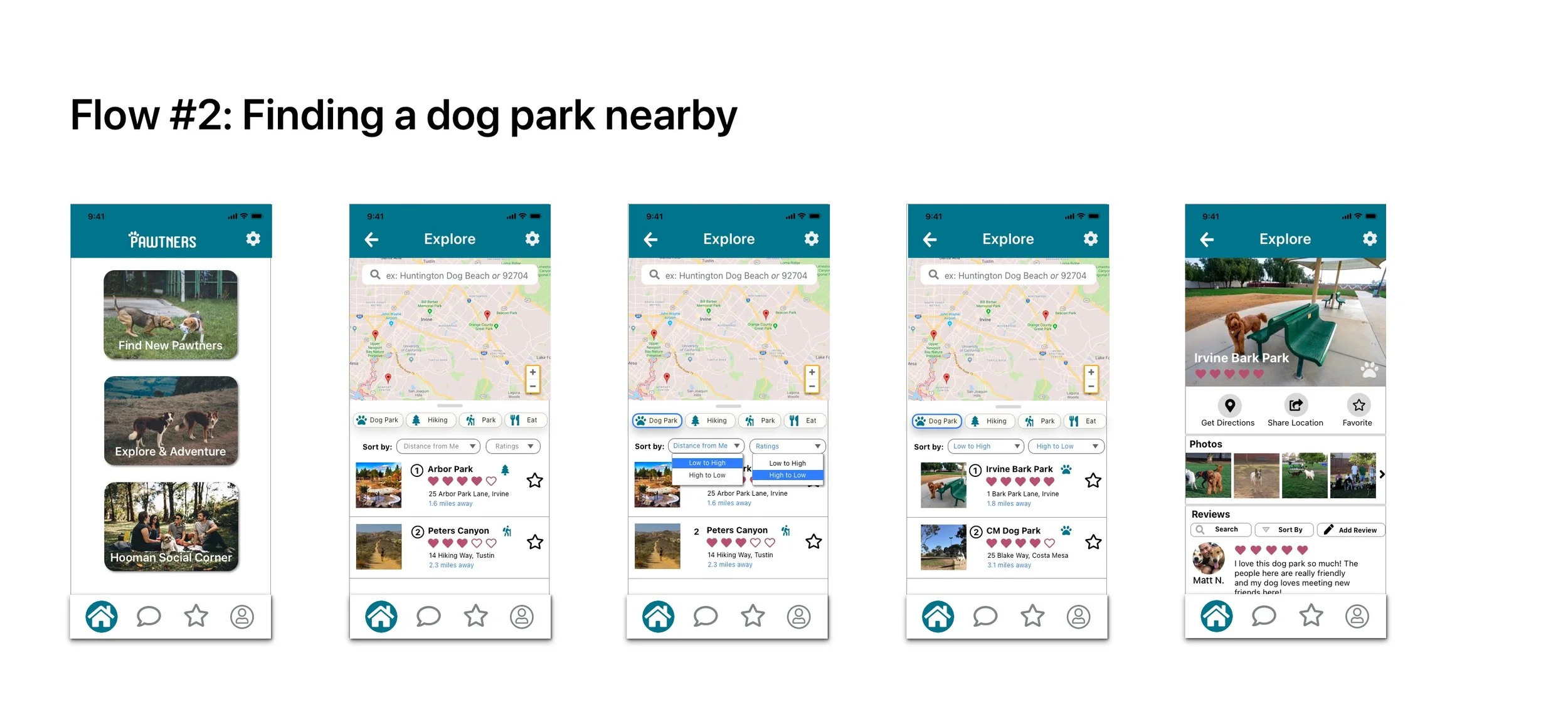
From the sketches and low-fidelity wireframes, I was able to create high-fidelity versions of the screens while staying consistent by referring to the style guide. The first three images of the flows below were all my first pass at creating high-fidelity screens. It was insightful to be able to go back and refer to these screens as time progressed and make fixes to improve Pawtners.
To ensure that Pawtners is accessible to all users, an audit was performed using Contrast Grid and the WebAIM Contrast Checker. This step was incredibly important as I found many issues with colors that I originally chose for the style guide; these were changed to ensure that anyone could use the app without issue.
Accessibility Review
To ensure that all users are able to use Pawtners regardless of physical or cognitive disabilities, I referred to the Web Content Accessibility Guidelines (WCAG 2.1), an internationally recognized set of recommendations for improved web accessibility.
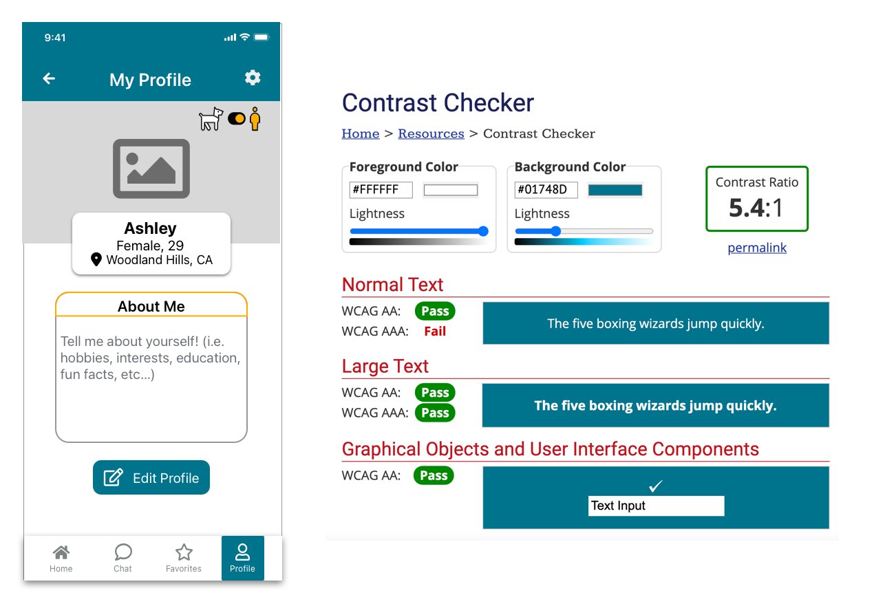
The teal blue, found in header title and icons, edit profile button, and the highlighted button on bottom navigation, all passed the accessibilty contrast ratio when tested.

The action buttons (directions, share location, favorite) had a grey background with a black button, which passed. I originally had the buttons as grey buttons with black text, but the grey didn’t pass accessibility, hence the new look.
User Testing & Iteration
I uploaded my screens from Sketch then used InVision for prototype and testing work. After making some fixes, I started to recruit users to test my high-fidelity prototype. Due to the pandemic, most testing was conducted remotely via Skype or Zoom (on which users were able to share their screens so I could see where their mouse cursors were heading and what was clicked on). Two individuals were able to test the app in-person. All users were encouraged to speak and think out loud while testing the prototype as they completed the three red routes:
Upload photos from your phone to your user profile and fill out the information.
Find a dog park nearby.
Send a message to a large dog that’s currently online.
The feedback I received from these rounds of user testing gave me the insights I needed to improve this iteration. I was surprised at how many things made sense when someone else told me from a different perspective, so much that I couldn’t believe the things I wasn’t able to see myself.
Strengths
Users appreciated a simple and uncluttered home page and bottom nav UI that didn’t need explanation when it came to what the app did
Users found section headers and labeled text fields made the app more intuitive and straightforward to use
Users felt safer in meeting up with strangers and their dogs when profiles included information and pictures that were deemed necessary to share (humans: location, age, gender | dog: age, behavior, gender)
Opportunities
Using icons without labels (especially outdated icons such as the floppy disk for “save”) confused users more than having helped them- floppy disks- that’s how old I am?!
The correct placement of buttons (hierarchy) are crucial; most users read top to bottom and don’t have the patience to read the whole page.
Drop down buttons need to include a label text above the container to remind users of what was selected; without a label, users had to go back a page to re-read what the options were.
Users can notice little details of inconsistency- including spacing and margins.
Clear verbiage is important, especially when it comes to labels and app directions (no need to be fancy).
Play with my Prototype!
Click on the button to access the prototype link, or play with it directly below!
What I Learned
Pawtners became a community where users could find one another in a safe manner to form new friendships for themselves and their furry friends. Working on this app, I was able to learn from observing all sorts of different individuals and personalities what was important to them when using social apps interacting with strangers- and what was truly important to dog owners.
I received a lot of positive feedback regarding intuitive and straightforward UI as well as a lot of helpful feedback that centered around navigation hierarchy, verbiage usage, and design consistency. People will most likely be repeat users if an app was designed with efficiency and simplicity. Smart labeling, simple naming conventions, and intuitive layout of the app were items that I iterated over and over throughout the process to ensure that users weren’t confused with the tasks at hand.
One of the most surprising things I learned throughout the research and discovery processes was that the user is always right. No matter what I thought looked and seemed correct, the truth will always come out during user testing and repeated iteration processes. I’m grateful that I learned a lot with my first UI/UX design project, working on something that held very close to my heart.


