Savr Recipes
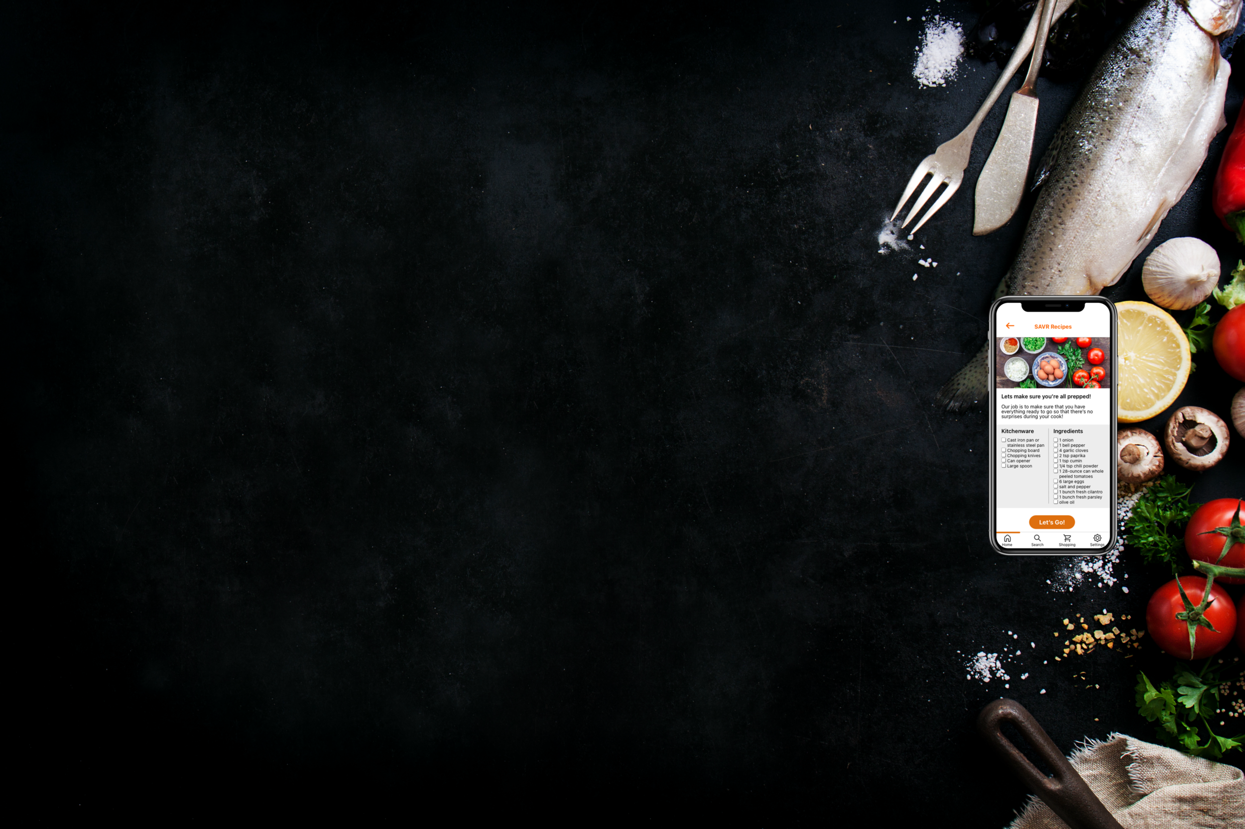
Savr Recipes is a mobile application to help people cook delicious meals efficiently. Users can enjoy learning to cook different genres, all with simple to follow step-by-step guidance.
My Role: UI/UX Designer, User Testing Moderator
Savr Recipes Design Sprint Project Background
After conducting initial secondary research by interviewing a handful of users, I found that the issues with SAVR Recipes included usability woes, unclear instructions, non-intuitive directions that ultimately made the experience harder, and created more issues.
As the sole UI and UX lead on the Sprint Design Method process, I used the interview information to create the sketches (information architecture), designed wireframe and prototype iterations, and conducted usability testing. I was given a total of 5 days to complete this project, where each day was broken out to different responsibilities: Mapping (Day 1), sketching (Day 2), creating a storyboard (Day 3), prototyping (Day 4), and validating (Day 5).
During this design sprint, I was the only person working on the project. My scopes covered user outreach, design, prototyping, and user testing.
Project Goals
Follow the GV Design Sprint process to promptly build a workable cooking mobile app prototype
Address critical business questions through mapping, sketching, deciding, prototyping, and testing with users within the 5 day window
Result
I was able to produce a viable prototype that demostrated how users would go about the cooking process
Click the link above to access my prototype!
The Problem
Although most recipes received positive feedback for producing delicious meals, critics of the app also had many complaints. Some said that recipes that were too advanced and included too many techniques to learn, had unclear instructions and badly written steps, and poor timing that threw off the cooking processes.
The Solution
To help address some issues found in Savr Recipes, I was tasked with fixing the order and flow of information that users ran into during the process.
I also wanted to focus my efforts on making sure that users had everything they needed (ingredients, cookware, time, instructions) during the start of the cooking process, and not have new items appear mid-course. Another goal was to limit the user’s interaction with the phone to merely “next” or “back” button clicks, but not have to open new windows to look up terminology or information mid cook.
Methodology
At the start of this project, I was provided notes and quotes from user interviews done previously. Some of the quotes that helped me plan included:
“There are some parts I don’t enjoy though…like emptying my cabinets because I don’t know what kitchenware I need, or constantly needing to wash my hands so I can refer back to my phone.”
“I can see what the finished product looks like, but I don’t know if I’m on the right track halfway through…is it supposed to look like this? If not, it’s better to know sooner rather than later.”
“I like to be ready for the next few steps. Sometimes I’ll be standing around waiting, and it’s not until later that I realize I could’ve saved 20 minutes by starting on something else.”
The Process
Day 1: Mapping
In order to provide an efficient app to help users cook meals seamlessly, I conducted a deep dive of current users and their thoughts. Through synthesizing research conducted through user interviews, I found the issues that needed to be addressed:
Steps weren’t properly ordered throughout the cooking process, which caused users to be surprised by last minute preparations. This applied to things like labor and prep- things that could have fit in between other steps.
Users would have liked the ultimate lay of the land and materials needed before the cooking started, such as needs for specific kitchenware items and ingredients.
The app needed to ensure that the user wouldn’t need to access their phone physically much throughout the cook, like having to stop what they’re doing to clean their hands in order to look up what “blanch” means.
In this image below, I mapped out a page of possible end-to-end user experiences that came to my mind.
Using the page above, I concluded on the user journey below to address the issues I had identified:
User -> Pick recipe & start cook -> “Things you need” checklist pops up -> whole video of cook shown (optional) -> Let’s get started screen -> First step (instructions, video of the cooking process, “things you need” for this step) -> New screen for showing for another step’s prep, if applicable -> Repeat until cook is done —> FINISH
Day 2: Sketching
To better understand the market, I dove into competitors that existed in the cooking app space. I quickly brainstormed features that I observed in these apps by using a technique called lightning demos. The lightning demo is basically a structured “show and tell” session to gather ideas and inspiration. I was able to get ideas, like features and components, that I could use in the framework I created.
The 3 competitors that I chose to do the demos on were:
BigOven
Recipe Keeper
Yummly
Overall, I absolutely loved the layout and feel of Yummly. It had tons of great features, including the upgraded pro features, which I took notes of features I’d like to apply to Savr Recipes. What I enjoyed the most was the videos and pictures that were attached to each step to clarify what was going on during that specific step.
The things I wanted to do differently was to arrange the hierarchy of some pages consistently throughout, as different recipes had different orders on their respective pages. I also wanted to make sure that the flow of information on each page was effective, especially for things like having ingredients above the steps. The hierarchy is very important so the user doesn’t feel unprepared or rushed for steps that come as surprises.
Crazy Eight’s
While selecting the most critical screen, you might ask yourself: At which step will the user complete the primary activity? Which screen is most important for solving this problem? Which screen is the most complex?
I used the “Crazy Eight” exercise to sketch a series of screens that tackled the problems addressed during the mapping stage. It helped expand on a critical screen that would be the most important for the user. I completed 2 exercises, which produced 16 screens in total, but here are a select few that I found to be the most helpful.
Out of the 16 screens, I selected 3 solution sketches that showed how to solve the problem. The first screen appears after a user has chosen the recipe they want to cook, and lets them know what is needed in both ingredients and kitchenware. The primary screen, in the center, solves the issue of users not feeling prepared by introducing a video to watch, as well as showing what ingredients are used in this step, and the steps within it. The third screen is a pop-up modal that tells a user to prepare ahead for a future cooking step while their food is cooking. This provides allows the cook to be smart by using free time efficiently.
Day 3: Storyboard & Decision
From the solution sketches, I came up with several UI functions that I thought of for the app, and time boxed my sketches for the 16 frame storyboard. Some of the functions were in direct competition with one another, and this visualization let me see how different functions could play into the wireframe.
I used notes of what users were looking for in a “better” app (obtained from user interviews) to see which frames fit those needs, and made sure that all the bases of user worries were covered. This step was highly crucial in helping me develop my low-fidelity red route sketches.
Day 4: Prototyping
After I developed my low-fidelity red routes from my storyboarding process, I created high-fidelity prototype screens and uploaded them to InVision for user testing.
Through testing my prototype with other users, I want to test a couple of things:
Is the home screen intuitive? (Do the header buttons make sense, and does the orange icon on the recipe images insinuate “click on this” to continue?)
How do users feel about the UI and function of the quick facts? (cook time, prep time, ingredients)
Are the list of ingredients/kitchenware helpful to a user?
Video or image for the recipe hero headers?
Does it make sense to show what each step requires? (Info like ingredients and kitchenware)
How does the user feel about the prepping ahead pop-up?
Are the action item buttons at the final screen useful?
How is the overall UI of the final screen?
Play with my prototype down below!
Day 5: Validate
On the final day of the design sprint, I met with 4 of my participants and conducted moderated remote testing on InVision via Zoom, and conducted 1 test in person. By having them all think out loud and being able to follow the movement of their cursors, I was able to hear and see each test participant’s preferences as well as their pain points.
To access my full validation testing report, please click here
Outcomes and Findings
Even though we were only allotted the five days to ideate and reach a prototyping stage, the information gathered through each day proved effective enough to be useful through designing and testing to provide a solutionable working prototype.
The usability tests I conducted with my quick turnaround prototype showed me the effectiveness of rapidly testing your screens through not wasting time on iterations that might not even come to fruition, and that quickly churned out ideas, no matter how broad or crazy, can help a designer mold ideas together.
I was nervous starting the Crazy 8’s exercise in fear that I may not spit out enough screens in the allotted time given. Turns out- even the crazy ideas make it into your final iterations sometimes!
Wording matters- how you label/title buttons and containers directly tell the user what the action item is.
Fingers and eyes don’t do well with small text and buttons- make everything legible and clickable so that the user doesn’t have to think too hard when flipping through pages of the app while cooking a recipe.
Users still want to know exactly how much of an ingredient they need from the start. Simplifying a text line to make it look uniform with the others doesn’t make it any easier to understand (1 tomato vs. tomatoes).
